An Employee-Owned Data Consultancy

8Bit Dashboard Remodel: Design Best Practices for Great Impact
Categories
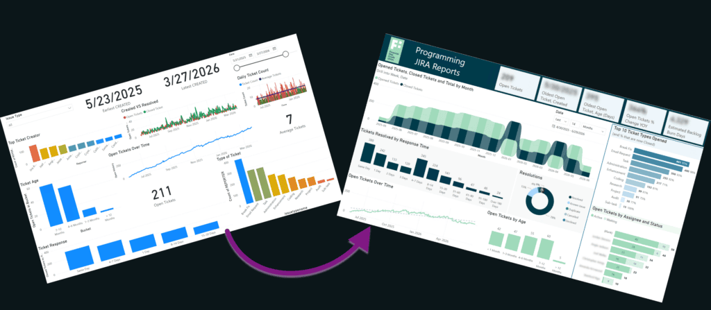
Look – I’m a data nerd. I want to show everything, so that anyone who sees my dashboards will want to nerd out with the data too. I love rainbow colors and lots of slicers on a page. I have limited innate design sense, and my visualization experience was all hands-on, not taught. When I started creating dashboards, my reports were not successful. Few views, and even fewer returning viewers left me disheartened. How could I make my reports impactful? How could I get users to love with the data as much as I did, and drive them to explore?
Today, I’m bringing you a dashboard remodel from a client, Financial Plus Credit Union. It’s a perfect example of where I started, and a great opportunity to illustrate report design and visualization best practices. In this post, I’ll discuss not only how I improved this report, but also why it is an improvement.
Before
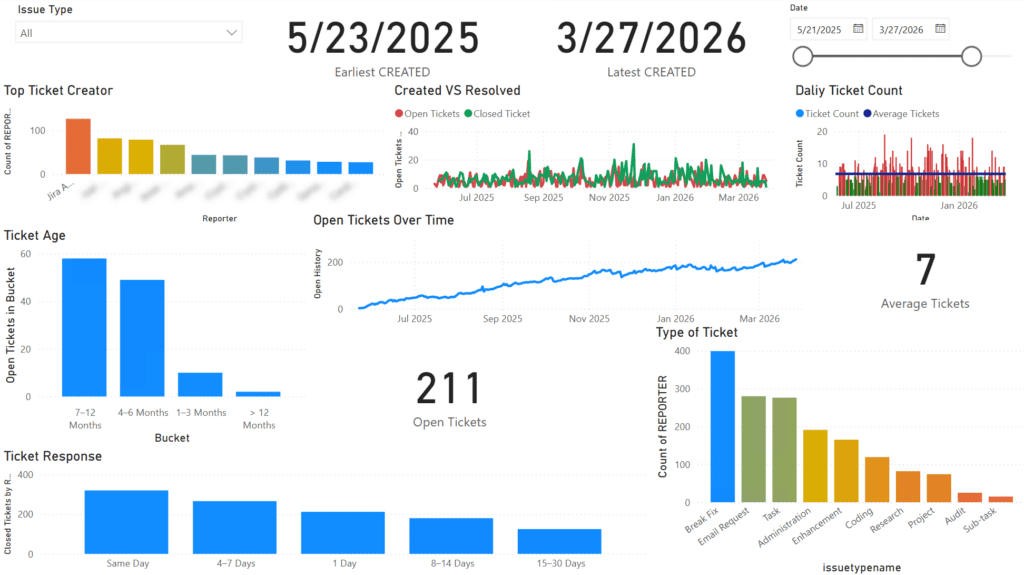
The credit union’s IT programming team used this dashboard to track Jira tickets. They adopted Jira a little over a year ago, and did not convert existing tickets. The goal of the report was to track open vs closed tickets, how long it takes to close a ticket, and where the tickets are coming from (type and submitter). Two interns from Kettering University’s Co-op program architected and built it. During the dashboard remodel, I included them as much as possible so they could take lessons learned into the future. You can read more about that aspect here in a case study write-up by 8Bit’s partner, Gemineye.
The Good:
Interns B and S did a great job with the data modeling, which is the most challenging part! They stuck to a star schema, created helper tables where needed, and used a date table the right way. They followed the instructions they were given precisely, and I had a great basis to work from while implementing a glow-up. Data modeling is a topic for another blog post, so I won’t go into detail here about how well they did and all the best practices they followed, but it was a very solid foundation.
The Challenge:
Once the credit union had the visuals they asked for, they found that “there was a lack of clear workload visibility and resolution metrics, resulting in limited ability to assess capacity, manage demand, and ensure timely delivery.” They weren’t sure what kind of work was coming in, whether or not results were being delivered in a timely fashion, whether they were making any progress on the backlog, and how the workload was being distributed across team members. B and S had all the right pieces and the right ideas, but I knew that a few tweaks and a dashboard remodel could shift the results and answer the right questions.
After
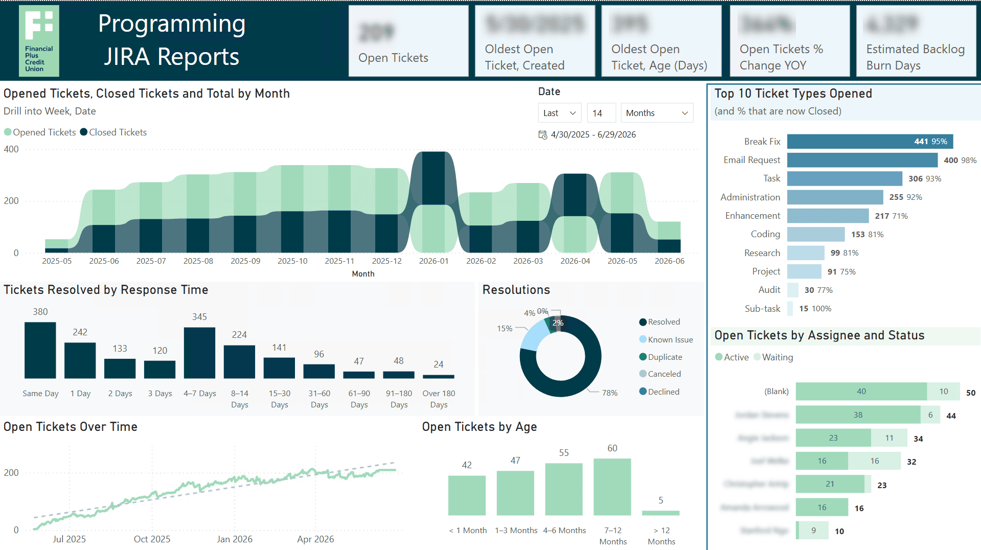
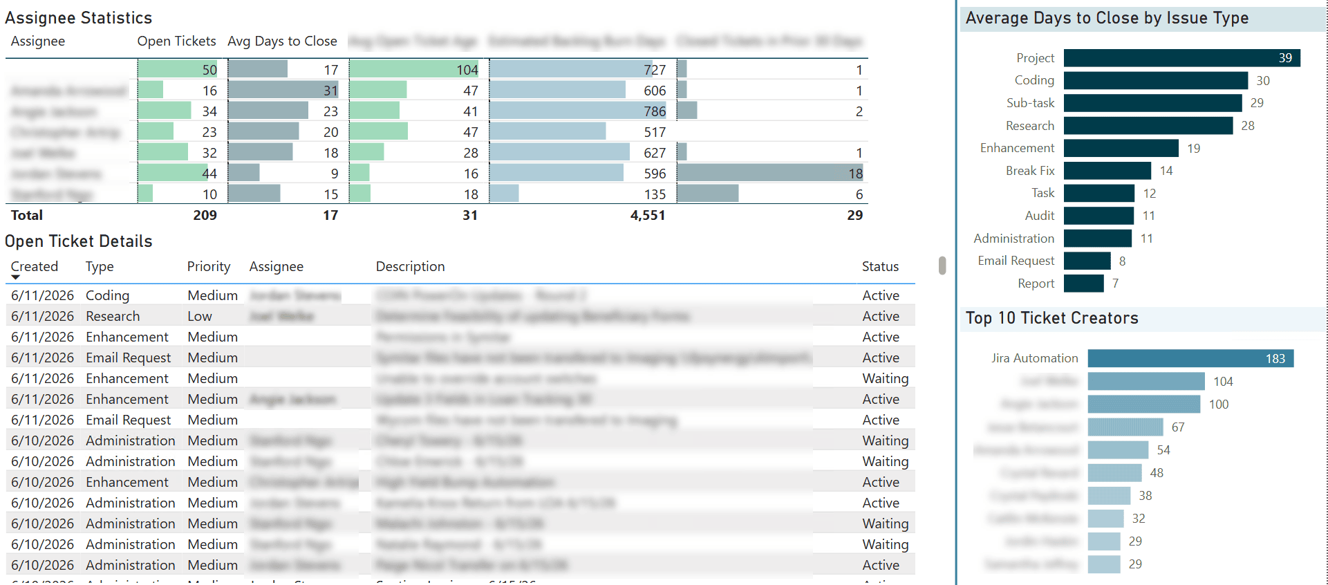
Here is the end result! It’s a major shift, so where do you begin a dashboard remodel?
Begin with the Audience
Before touching anything, I needed to talk about it with the stakeholders. After reviewing the underlying data model, I knew enough to ask for clarity. (Don’t miss our article about the three essential steps to take before designing a dashboard!) Through careful questioning, we identified the audience as senior leadership and the board. The dashboard would be successful if they could use it to balance work appropriately and motivate the team to close tickets faster.
Essential questions that needed clarity included:
- What does the incoming IT work consist of? (volume, type, and effort)
- What months is the team getting ahead? What things were happening at the time to contribute to that success?
- How long on average are tickets taking to complete? What types of tickets absorb the most resource time?
- How is workload distributed across team members? Is the reactive workflow and lack of workload clarity driving team burnout?
- To meet the demands of the credit union, is the team capacity sufficient, or what would need to change to ensure demands are met?
With the most important report parameters identified, it was time to begin.
Dashboard Remodel
Report Layout
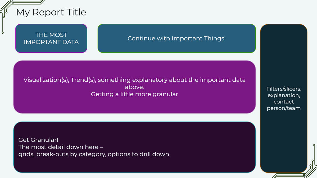
The most effective report begins with the single most important piece of information you need to convey, such as a vital KPI (key performance indicator). Continuing in a Z pattern, add additional metrics that are critically important, followed by trends or breakdowns, followed by details. Here is an example of the layout I try to follow:
KPIs
The first thing that struck me about FPCU’s dashboard was the set of date KPIs in the middle. The size and position indicated importance, but the metrics themselves wouldn’t tell a viewer very much. If there was one number the senior leadership wanted to know, it was open tickets. I positioned that as the most important KPI.

The “earliest created” ticket measure told us just that, but it didn’t filter to open tickets. It was simply the first ticket that had been opened within the chosen date filter. To honor the requirement the interns had, I kept earliest created, but did filter to only open tickets. I also added the age in days of the oldest open ticket, and excluded all three KPIs from the date slicer.

In the last part of the KPIs section, I picked my own metrics to include based on the questions the team needed to answer. Are open tickets increasing year over year? How long would it take to complete all the open tickets if the team continued to average the same rate of closure based on ticket type?
Trends
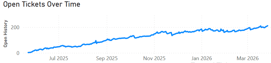
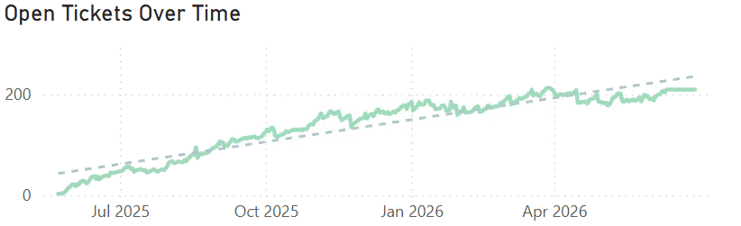
The Kettering interns included three trend charts. Open Tickets Over Time was fantastic. I added a trend line and removed a label, but the original already conveyed the important information perfectly. The trend line adds context to the slope of the line, to ease the cognitive load.
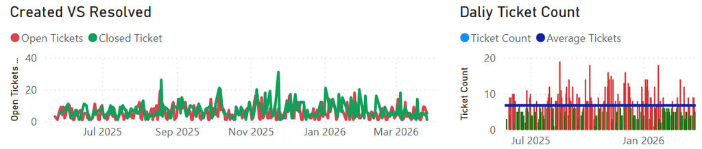
The other two visuals show a high degree of granularity, so we lose the message in the noise. The IT team wants to know whether they are getting ahead (closing more than get opened) or falling behind. I replaced them with a ribbon chart that starts with the monthly level, but drills into weekly and daily granularity. In combination with the Date slicer adjacent to it, they can see which months, weeks, or days were getting ahead depending on whether closed or open tickets are on top. This one visual serves a majority of the team’s goals.
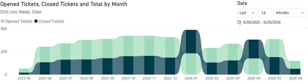
Report builders use ribbon charts less often than line charts or bar charts, but they are valuable for showing magnitude of the total as well as the relative ranking of the separate elements. By using this, I do lose that very quick comparison of the magnitude of open and closed tickets. How far ahead is one or the other in a given month? A report user has to use the tooltips to get those details, where I added a % of total calculation. However, I felt this tradeoff was worthwhile because of how much information a quick glance gave in terms of “getting ahead” or “falling behind.”
Breakdowns
Breakdowns by category included ticket creator, ticket type, open ticket age, and closed ticket response time. I started with creator and type.
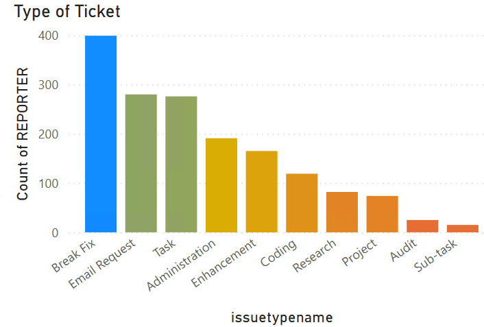
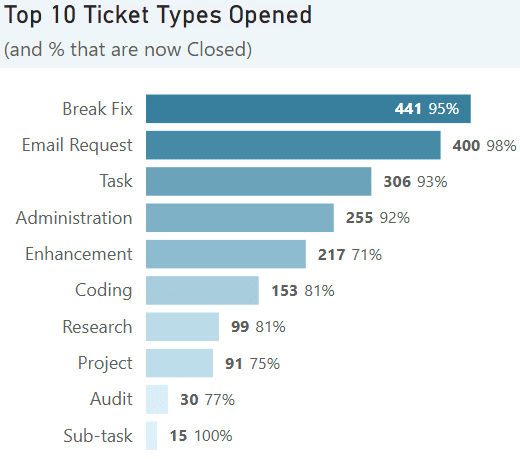

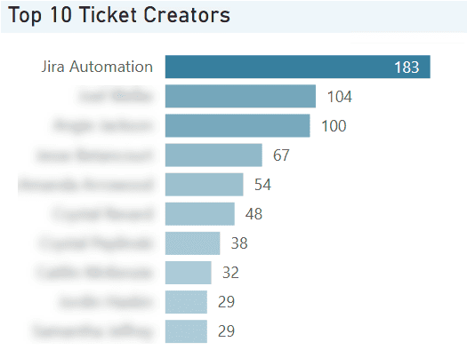
I took several actions around these breakdowns.
- First, I eliminated the axis labels and moved the important information to the title, so there is less visual eye clutter and more focus on the data. I also direct labeled the columns for faster visual recognition and so that screenshots on board slides would have details normally held in tooltips.
- Second, I switched to a vertical bar chart because of the layout and spacing available to me. A sidebar with multiple compact visuals made more sense than making the page longer or wider.
- Third, I felt that knowing the top 10 ticket types opened in the selected period was important, but I also thought there was value in how many of those were closed. Rather than create another visual, I tacked the percentage onto the same column chart.
- Fourth and finally, I used color as a pre-attentive attribute; that is, your eye catches visual cues before your brain fully processes them. A gradient applied to a bar chart like this subtly draws attention to the highest counts and lets the other bars gradually fade from notice, keeping my viewer’s attention on the more important data points while including the others for scale.
Data Model Modification
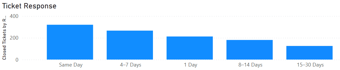
When I moved on to open ticket age and closed ticket response time, I found the first place I needed to edit the underlying data model. The interns had created a helper table with age bucket names, a minimum days, and a maximum days. The table contained both sets of age buckets, but the default sort order was based on frequency. A report viewer has to spend more time looking at labels and interpreting what they are seeing, when most report viewers would expect buckets to be sorted chronologically.
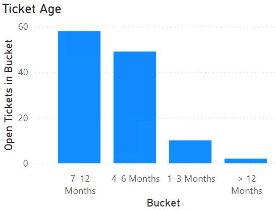
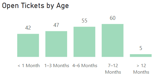
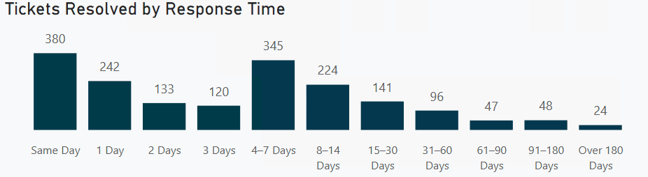
I cleaned this up by adding a SortOrder column to the helper table. Notice that the first set of buckets has sort one through 11, and the second set starts at 20. If they expand or condense these buckets later, there will be fewer to update.

After adding, I modified the Bucket column to use SortOrder as the sort order by default.

Finally, I expanded the ticket resolution response time visualization to include all of the relevant buckets instead of limiting to the top five most frequent. If I had more analyst leeway, I would have tried some different bucket sizes to see if a different distribution would tell a new story, but the business determined the bucket sizes and I left them alone.
New Visuals
IT leadership had questions that weren’t easily answered by the existing dashboard. After remodeling what existed, I added new content to cover it.
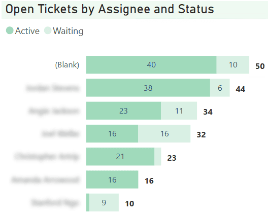
How is work distributed?
I wanted to see where open tickets were assigned. However, when I explored the data, I noticed that Jira had an Active and Waiting status available. As an IT manager, I’d want to know if the tickets waited on the business, or if the tickets waited on my team. Therefore, I included the status and direct labeled counts.
How much effort will the incoming work take?
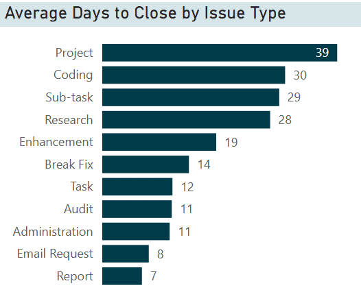
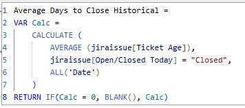
Leadership needed to know what to expect, which led to the most challenging calculation in the report. Average days to close an issue seems simple, but it is anything but. If I calculate the averages based on all time, I catch long-tail issues but any recent improvements to speed won’t show for quite some time. If I calculate averages based on recently closed tickets, I risk overestimating if an old ticket closed recently, or underestimating if team members resolved recent tickets faster than normal.
In this case, I spoke to the business and gave them both options. The stakeholders decided that for now, the report uses averages based on all time.
To meet the demands of the credit union, is the current team enough?
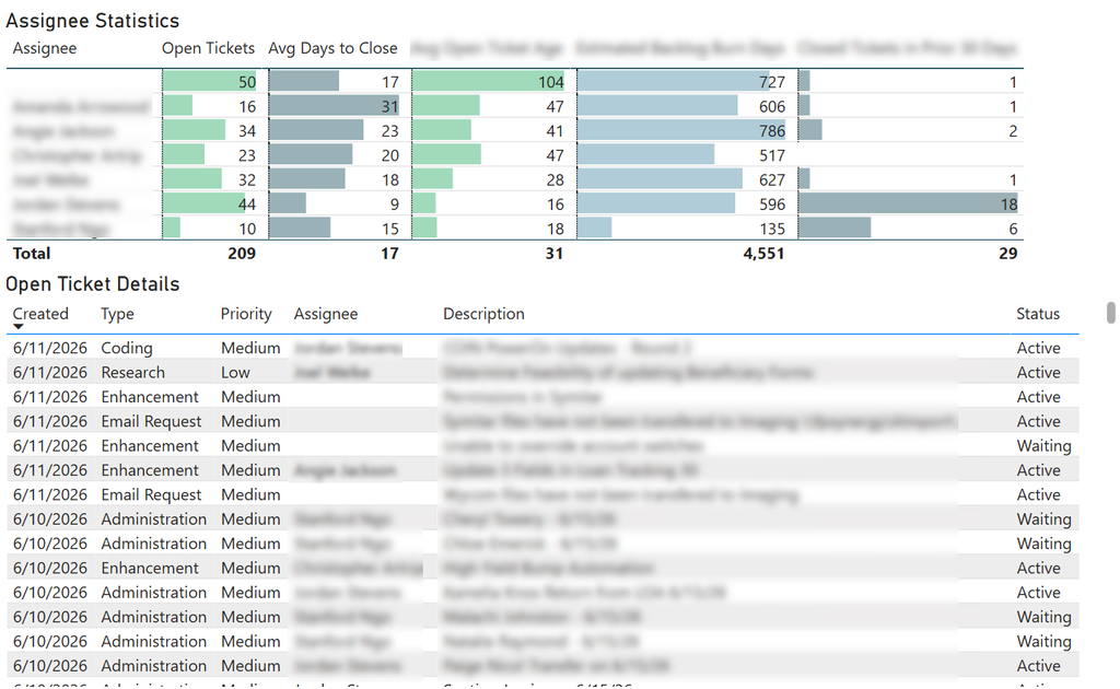
Because this question is complicated, I placed the answer into the granular details section below the breakouts. For the team members, I added open tickets, average days to close, average open ticket age, estimated backlog burn days, and closed tickets in the prior 30 days. These visuals are fully interactive with the other breakdowns on the page. Leadership can see what issue types a team member has or their open tickets by age. Likewise, the Open Ticket Details at the bottom is a quick way to interact with any “open” thing on the page and see what issues comprise the results. This careful interaction lets users explore the data without getting overwhelmed. It also answers questions that arise with a few clicks.
Colors and Color Theory
I briefly mentioned color as a pre-attentive attribute on two of my Top 10 breakdowns. Let’s talk about the other color theory at play here!
Brand Colors
An organization that sees a report with their brand colors on it will trust it more. Ideally, they already have a data palette with 10-12 acceptable colors and variations that is accessible to anyone who is color-blind. In this case, FPCU has two official colors and I filled in the rest with intuition based on their website.
If you have trouble getting an official logo file from their organization’s marketing and brand team, I frequently find a high quality svg or png file on the front page of their website. Right click, open in new tab, and save the logo to use in your report.
Consistent Colors
Select colors for measures that are consistent. In this report, every metric relating to open tickets is mint green, and every metric relating to closed tickets is navy blue. A user won’t realize it consciously, but subconsciously this reduces the cognitive load required to understand the visuals.
I made two exceptions to this in order to have the overall report look balanced in the sidebar breakdowns.
In Conclusion
This dashboard remodel focuses on clarity, consistency, and conciseness. I started with defining the audience and what they needed from the report. Then I tackled the layout of the overall page and of individual visuals to have more visual impact. The user doesn’t need to work as hard with direct labels, logically ascending buckets, and consistent color. I added visuals to cover questions not covered in the original report and gave users the ability to explore and dig into the underlying data intuitively. These tactics keep users returning to your reports and getting the answers they need to act.
I hope you enjoyed this remodel and explanation, and I hope you took away some tips you hadn’t thought of before. I’m proof that you can learn great dashboard design and color theory without having the innate skills! Keep these concepts in mind, and if you knew them already, pass them on to a junior analyst.
Shameless pitch here: if your organization has dashboards that need a glow-up, contact 8Bit and let’s talk about it! We also offer a class for your reporting and analytics team that goes into these concepts in more depth called Report Creation and Visualization Best Practices. In this class, find out why data looks better naked!
Be the first to comment